
Mastering Custom SageMaker Deployment: A Comprehensive Guide
A deep dive into the intricacies of deploying custom models to Amazon SageMaker

this notebook attempts to answer various data science question from 4 categories
based on the COVID-19 daily cases, deaths, and recoveries, the focus is primarily on Malaysia.
the dataset is obtained from the center for system science and engineering (CSSE) https://github.com/CSSEGISandData/COVID-19
for predictive analysis, a LSTM model is used to predict the upcoming cases
based on solely the previous day’s data considering no other factors,
still, LSTM are very popular for such task because of their accuracy and ability to generalize data.
the used framework for the predictive model is TensorFlow 2.x
this notebook takes some code from a larger project i have been working on for a while, it’s a modular architecture that can predict cases for any country just given a timeseries of its previous cases using 3 different models, the project can be found here https://www.kaggle.com/abubakaryagob/covid-19-forecasting-automated-edition
import pandas as pd
import numpy as np
import matplotlib.pyplot as plt
import tensorflow as tf
from datetime import datetime
from sklearn.preprocessing import MinMaxScaler
from keras.preprocessing.sequence import TimeseriesGenerator
from keras.models import Sequential
from keras.layers import Dense, LSTM, Dropout, Activation, GlobalMaxPooling1D
from keras.optimizers import Adam

%matplotlib inline
read in the datasets
df_confirmed = pd.read_csv("../input/covid-19/time_series_covid19_confirmed_global.csv")
df_deaths = pd.read_csv("../input/covid-19/time_series_covid19_deaths_global.csv")
df_reco = pd.read_csv("../input/covid-19/time_series_covid19_recovered_global.csv")
after reading in our dataset lets take a look at it by showing the first few countries for confirmed case, deaths, and recoveries
df_confirmed.head()
| Province/State | Country/Region | Lat | Long | 1/22/20 | 1/23/20 | 1/24/20 | 1/25/20 | 1/26/20 | 1/27/20 | ... | 12/2/20 | 12/3/20 | 12/4/20 | 12/5/20 | 12/6/20 | 12/7/20 | 12/8/20 | 12/9/20 | 12/10/20 | 12/11/20 | |
|---|---|---|---|---|---|---|---|---|---|---|---|---|---|---|---|---|---|---|---|---|---|
| 0 | NaN | Afghanistan | 33.93911 | 67.709953 | 0 | 0 | 0 | 0 | 0 | 0 | ... | 46718 | 46837 | 46837 | 47072 | 47306 | 47516 | 47716 | 47851 | 48053 | 48116 |
| 1 | NaN | Albania | 41.15330 | 20.168300 | 0 | 0 | 0 | 0 | 0 | 0 | ... | 39719 | 40501 | 41302 | 42148 | 42988 | 43683 | 44436 | 45188 | 46061 | 46863 |
| 2 | NaN | Algeria | 28.03390 | 1.659600 | 0 | 0 | 0 | 0 | 0 | 0 | ... | 85084 | 85927 | 86730 | 87502 | 88252 | 88825 | 89416 | 90014 | 90579 | 91121 |
| 3 | NaN | Andorra | 42.50630 | 1.521800 | 0 | 0 | 0 | 0 | 0 | 0 | ... | 6842 | 6904 | 6955 | 7005 | 7050 | 7084 | 7127 | 7162 | 7190 | 7236 |
| 4 | NaN | Angola | -11.20270 | 17.873900 | 0 | 0 | 0 | 0 | 0 | 0 | ... | 15319 | 15361 | 15493 | 15536 | 15591 | 15648 | 15729 | 15804 | 15925 | 16061 |
5 rows × 329 columns
each of the dataframes contains data for all countries, we only need malaysia so lets extract that from it
my_confirmed = df_confirmed[df_confirmed["Country/Region"] == "Malaysia"]
my_deaths = df_deaths[df_deaths["Country/Region"] == "Malaysia"]
my_reco = df_reco[df_reco["Country/Region"] == "Malaysia"]
now lets take a look at our data for Malaysia
my_confirmed
| Province/State | Country/Region | Lat | Long | 1/22/20 | 1/23/20 | 1/24/20 | 1/25/20 | 1/26/20 | 1/27/20 | ... | 12/2/20 | 12/3/20 | 12/4/20 | 12/5/20 | 12/6/20 | 12/7/20 | 12/8/20 | 12/9/20 | 12/10/20 | 12/11/20 | |
|---|---|---|---|---|---|---|---|---|---|---|---|---|---|---|---|---|---|---|---|---|---|
| 173 | NaN | Malaysia | 4.210484 | 101.975766 | 0 | 0 | 0 | 3 | 4 | 4 | ... | 68020 | 69095 | 70236 | 71359 | 72694 | 74294 | 75306 | 76265 | 78499 | 80309 |
1 rows × 329 columns
our data is in a format that will not allow us to use it for graphing or predictions, first we should reshape the data to a format that is more friendly to our goal
# convert passed dataframe to a timeseries (a format easy to graph and use for training models)
def confirmed_timeseries(df):
    df_series = pd.DataFrame(df[df.columns[4:]].sum(),columns=["confirmed"])
    df_series.index = pd.to_datetime(df_series.index,format = '%m/%d/%y')
    return df_series

def deaths_timeseries(df):
    df_series = pd.DataFrame(df[df.columns[4:]].sum(),columns=["deaths"])
    df_series.index = pd.to_datetime(df_series.index,format = '%m/%d/%y')
    return df_series

def reco_timeseries(df):
    # no index to timeseries conversion needed (all is joined later)
    df_series = pd.DataFrame(df[df.columns[4:]].sum(),columns=["recovered"])
    return df_series
# convert each dataframe to a timeseries
my_con_series = confirmed_timeseries(my_confirmed)
my_dea_series = deaths_timeseries(my_deaths)
my_reco_series = reco_timeseries(my_reco)
my_con_series
| confirmed | |
|---|---|
| 2020-01-22 | 0 |
| 2020-01-23 | 0 |
| 2020-01-24 | 0 |
| 2020-01-25 | 3 |
| 2020-01-26 | 4 |
| ... | ... |
| 2020-12-07 | 74294 |
| 2020-12-08 | 75306 |
| 2020-12-09 | 76265 |
| 2020-12-10 | 78499 |
| 2020-12-11 | 80309 |
325 rows × 1 columns
now that we have our data as a time series, lets join all the differnet cases (confirmed, deaths, recovred) together so its easier to graph them
# join all 3 data frames
my_df = my_con_series.join(my_dea_series, how = "inner")
my_df = my_df.join(my_reco_series, how = "inner")
now lets take a look at our final dataframe
my_df
| confirmed | deaths | recovered | |
|---|---|---|---|
| 2020-01-22 | 0 | 0 | 0 |
| 2020-01-23 | 0 | 0 | 0 |
| 2020-01-24 | 0 | 0 | 0 |
| 2020-01-25 | 3 | 0 | 0 |
| 2020-01-26 | 4 | 0 | 0 |
| ... | ... | ... | ... |
| 2020-12-07 | 74294 | 384 | 62306 |
| 2020-12-08 | 75306 | 388 | 64056 |
| 2020-12-09 | 76265 | 393 | 65124 |
| 2020-12-10 | 78499 | 396 | 66236 |
| 2020-12-11 | 80309 | 402 | 67173 |
325 rows × 3 columns
we can see that its now in a format that is easy to interpret, graph and use for predictions with all columns included
my_df.plot(figsize=(14,7),title="Malysia confirmed, deaths, and recoverd cases")
<matplotlib.axes._subplots.AxesSubplot at 0x7f2ab8657a90>
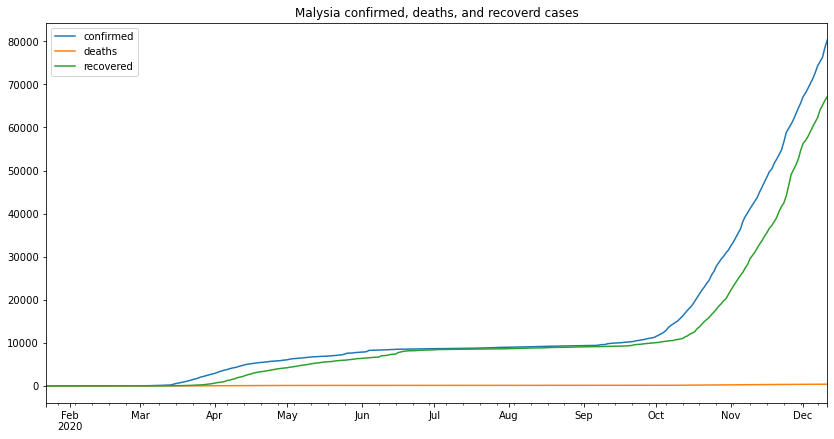
from the above graph we can make several remarks, one of which is that the second wave started at the beginning of September and its still going as the time of writing this (13-12-2020)
to calculate the percentage of cases that led to death, we first need to know the number of cases that led to an outcome, from that we can easily extract the number of cases that led to death and from that we can calculate the percentage against all the cases that had an outcome
my_cases_outcome = (my_df.tail(1)['deaths'] + my_df.tail(1)['recovered'])[0]
my_outcome_perc = (my_cases_outcome / my_df.tail(1)['confirmed'] * 100)[0]
my_death_perc = (my_df.tail(1)['deaths'] / my_cases_outcome * 100)[0]
my_reco_perc = (my_df.tail(1)['recovered'] / my_cases_outcome * 100)[0]
my_active = (my_df.tail(1)['confirmed'] - my_cases_outcome)[0]

print(f"Number of cases which had an outcome: {my_cases_outcome}")
print(f"percentage of cases that had an outcome: {round(my_outcome_perc, 2)}%")
print(f"Deaths rate: {round(my_death_perc, 2)}%")
print(f"Recovery rate: {round(my_reco_perc, 2)}%")
print(f"Currently Active cases: {my_active}")
Number of cases which had an outcome: 67575
percentage of cases that had an outcome: 84.14%
Deaths rate: 0.59%
Recovery rate: 99.41%
Currently Active cases: 12734
we can see from the above results that the percentage of cases that led to death is 0.59% which is very miniscule in the grand scheme of things, this tells us that although Malaysia has had a considerable number of cases most of them did not end in deaths, in simpler terms, for every 200 cases only 1 death occured.
this is where we train an LSTM RNN to predict upcoming cases, we will make predictions for the next 20 days, for testing the accuracy of our model, we will take the last 20 days from the dataset and use them for testing
n_input = 20  # number of steps (days to predict)
n_features = 1 # number of y (model outputs)

# preporcess a dataframe and create required vairables for training the LSTM
# train: the data used to make the training generator
# test: the data used to make the test generator
# scaler: data scaler to normalize the data (easier for the model)
# scaled_train: train dataset scaled down to the largest value in the dataset
# scaled test: train dataset scaled down to the largest value in the dataset
# generator: train data generator, used to train the model by feeding it batches of the train data
# validation_generator: validation data generator, used to validate the model during training
#                       by feeding it batches of a randomly selected points from the train dataset

def prepare_data(df):
    # drop rows with zeros
    df = df[(df.T != 0).any()]

    num_days = len(df) - n_input
    train = df.iloc[:num_days]
    test = df.iloc[num_days:]

    # normalize the data according to largest value
    scaler = MinMaxScaler()
    scaler.fit(train) # find max value

    scaled_train = scaler.transform(train) # divide every point by max value
    scaled_test = scaler.transform(test)

    # feed in batches [t1,t2,t3] --> t4
    generator = TimeseriesGenerator(scaled_train,scaled_train,length = n_input,batch_size = 1)
    validation_set = np.append(scaled_train[55],scaled_test) # random tbh
    validation_set = validation_set.reshape(n_input + 1,1)
    validation_gen = TimeseriesGenerator(validation_set,validation_set,length = n_input,batch_size = 1)

    return scaler, train, test, scaled_train, scaled_test, generator, validation_gen
# create, train and return LSTM model
def train_lstm_model():
    model = Sequential()
    model.add(LSTM(84, recurrent_dropout = 0, return_sequences = True, input_shape = (n_input,n_features)))
    model.add(LSTM(84, recurrent_dropout = 0.1, use_bias = True, return_sequences = True,))
    model.add(GlobalMaxPooling1D())
    model.add(Dense(84, activation = "relu"))
    model.add(Dense(1))

    # compile model
    model.compile(loss = 'mse', optimizer = Adam(1e-5))

    # finally train the model using generators
    model.fit_generator(generator,
                        validation_data = validation_gen,
                        epochs = 300,
                        steps_per_epoch = round(len(train) / n_input),
                        verbose = 0
                       )

    return model
# predict, rescale and append needed columns to final data frame
def lstm_predict(model):
    # holding predictions
    test_prediction = []

    # last n points from training set
    first_eval_batch = scaled_train[-n_input:]
    current_batch = first_eval_batch.reshape(1,n_input,n_features)

    # predict first x days from testing data
    for i in range(len(test) + n_input):
        current_pred = model.predict(current_batch)[0]
        test_prediction.append(current_pred)
        current_batch = np.append(current_batch[:,1:,:],[[current_pred]],axis=1)

    # inverse scaled data
    true_prediction = scaler.inverse_transform(test_prediction)

    MAPE, accuracy, sum_errs, interval, stdev, df_forecast = gen_metrics(true_prediction)

    return MAPE, accuracy, sum_errs, interval, stdev, df_forecast

# plotting model losses
def plot_lstm_losses(model):
    pd.DataFrame(model.history.history).plot(figsize = (14,7), title = "loss vs epochs curve")
# generate metrics and final df
def gen_metrics(pred):
    # create time series
    time_series_array = test.index
    for k in range(0, n_input):
        time_series_array = time_series_array.append(time_series_array[-1:] + pd.DateOffset(1))

    # create time series data frame
    df_forecast = pd.DataFrame(columns = ["confirmed","confirmed_predicted"],index = time_series_array)

    # append confirmed and predicted confirmed
    df_forecast.loc[:,"confirmed_predicted"] = pred
    df_forecast.loc[:,"confirmed"] = test["confirmed"]

    # create and append daily cases (for both actual and predicted)
    daily_act = []
    daily_pred = []

    #actual
    daily_act.append(abs(df_forecast["confirmed"].iloc[1] - train["confirmed"].iloc[-1]))
    for num in range((n_input * 2) - 1):
        daily_act.append(df_forecast["confirmed"].iloc[num + 1] - df_forecast["confirmed"].iloc[num])

    # predicted
    daily_pred.append(df_forecast["confirmed_predicted"].iloc[1] - train["confirmed"].iloc[-1])
    for num in range((n_input * 2) - 1):
        daily_pred.append(df_forecast["confirmed_predicted"].iloc[num + 1] - df_forecast["confirmed_predicted"].iloc[num])


    # calculate mean absolute percentage error
    MAPE = np.mean(np.abs(np.array(df_forecast["confirmed"][:n_input]) -
                          np.array(df_forecast["confirmed_predicted"][:n_input])) /
                   np.array(df_forecast["confirmed"][:n_input]))

    accuracy = round((1 - MAPE) * 100, 2)

    # the error rate
    sum_errs = np.sum((np.array(df_forecast["confirmed"][:n_input]) - np.array(df_forecast["confirmed_predicted"][:n_input])) ** 2)

    # error standard deviation
    stdev = np.sqrt(1 / (n_input - 2) * sum_errs)


    # calculate prediction interval
    interval = 1.96 * stdev


    # append the min and max cases to final df
    df_forecast["confirm_min"] = df_forecast["confirmed_predicted"] - interval
    df_forecast["confirm_max"] = df_forecast["confirmed_predicted"] + interval

    # appened daily data
    df_forecast["daily"] = daily_act
    df_forecast["daily_predicted"] = daily_pred

    daily_err = np.sum((np.array(df_forecast["daily"][:n_input]) - np.array(df_forecast["daily_predicted"][:n_input])) ** 2)
    daily_stdev = np.sqrt(1 / (n_input - 2) * daily_err)
    daily_interval = 1.96 * daily_stdev

    df_forecast["daily_min"] = df_forecast["daily_predicted"] - daily_interval
    df_forecast["daily_max"] = df_forecast["daily_predicted"] + daily_interval

    # round all df values to 0 decimal points
    df_forecast = df_forecast.round()

    return MAPE, accuracy, sum_errs, interval, stdev, df_forecast
# print metrics for given county
def print_metrics(mape, accuracy, errs, interval, std, model_type):
    m_str = "LSTM" if model_type == 0 else "ARIMA" if model_type == 1 else "HES"
    print(f"{m_str} MAPE: {round(mape * 100, 2)}%")
    print(f"{m_str} accuracy: {accuracy}%")
    print(f"{m_str} sum of errors: {round(errs)}")
    print(f"{m_str} prediction interval: {round(interval)}")
    print(f"{m_str} standard deviation: {std}")
# for plotting the range of predicetions
def plot_results(df, country, algo):
    fig, (ax1, ax2) = plt.subplots(2, figsize = (14,20))
    ax1.set_title(f"{country} {algo} confirmed predictions")
    ax1.plot(df.index,df["confirmed"], label = "confirmed")
    ax1.plot(df.index,df["confirmed_predicted"], label = "confirmed_predicted")
    ax1.fill_between(df.index,df["confirm_min"], df["confirm_max"], color = "indigo",alpha = 0.09,label = "Confidence Interval")
    ax1.legend(loc = 2)

    ax2.set_title(f"{country} {algo} confirmed daily predictions")
    ax2.plot(df.index, df["daily"], label = "daily")
    ax2.plot(df.index, df["daily_predicted"], label = "daily_predicted")
    ax2.legend()

    import matplotlib.dates as mdates
    ax1.xaxis.set_major_formatter(mdates.DateFormatter('%b %-d'))
    ax2.xaxis.set_major_formatter(mdates.DateFormatter('%b %-d'))
    fig.show()
# prepare the data (using confirmed cases dataset)

scaler, train, test, scaled_train, scaled_test, generator, validation_gen = prepare_data(my_con_series)
# train lstm model
my_lstm_model = train_lstm_model()

# plot lstm losses
plot_lstm_losses(my_lstm_model)
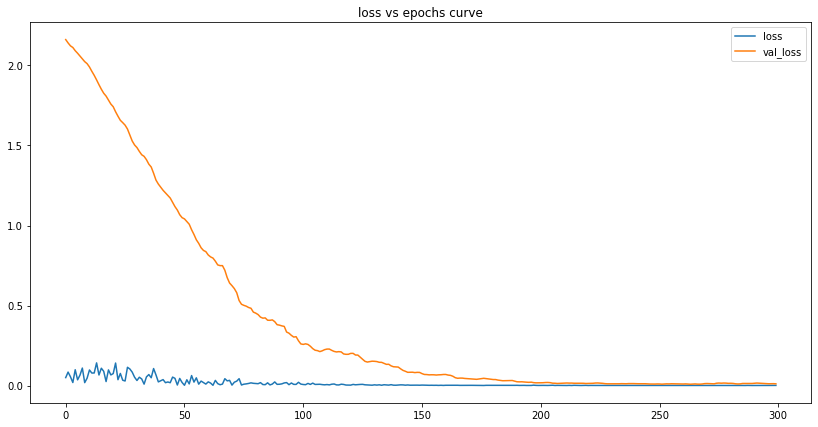
We can see that the number of losses is tiny at the end of our training. This tells us the model has successfully learned the data and can - to some degree of accuracy - make predictions based on it.
lets first calculate the accuracy for our testing dataset
my_mape, my_accuracy, my_errs, my_interval, my_std, my_lstm_df = lstm_predict(my_lstm_model)

print_metrics(my_mape, my_accuracy, my_errs, my_interval, my_std, 0) # 0 here means LSTM

my_lstm_df
LSTM MAPE: 2.01%
LSTM accuracy: 97.99%
LSTM sum of errors: 43483777.0
LSTM prediction interval: 3046.0
LSTM standard deviation: 1554.2732613061567
| confirmed | confirmed_predicted | confirm_min | confirm_max | daily | daily_predicted | daily_min | daily_max | |
|---|---|---|---|---|---|---|---|---|
| 2020-11-22 | 54775.0 | 57453.0 | 54407.0 | 60499.0 | 2980.0 | 5020.0 | 3592.0 | 6448.0 |
| 2020-11-23 | 56659.0 | 58699.0 | 55653.0 | 61746.0 | 1884.0 | 1246.0 | -182.0 | 2674.0 |
| 2020-11-24 | 58847.0 | 59943.0 | 56896.0 | 62989.0 | 2188.0 | 1243.0 | -184.0 | 2671.0 |
| 2020-11-25 | 59817.0 | 61181.0 | 58134.0 | 64227.0 | 970.0 | 1238.0 | -190.0 | 2666.0 |
| 2020-11-26 | 60752.0 | 62414.0 | 59368.0 | 65460.0 | 935.0 | 1233.0 | -194.0 | 2661.0 |
| 2020-11-27 | 61861.0 | 63595.0 | 60549.0 | 66641.0 | 1109.0 | 1181.0 | -247.0 | 2609.0 |
| 2020-11-28 | 63176.0 | 64755.0 | 61708.0 | 67801.0 | 1315.0 | 1160.0 | -268.0 | 2588.0 |
| 2020-11-29 | 64485.0 | 65907.0 | 62861.0 | 68954.0 | 1309.0 | 1152.0 | -275.0 | 2580.0 |
| 2020-11-30 | 65697.0 | 67042.0 | 63995.0 | 70088.0 | 1212.0 | 1134.0 | -293.0 | 2562.0 |
| 2020-12-01 | 67169.0 | 68159.0 | 65113.0 | 71205.0 | 1472.0 | 1117.0 | -310.0 | 2545.0 |
| 2020-12-02 | 68020.0 | 69259.0 | 66212.0 | 72305.0 | 851.0 | 1100.0 | -328.0 | 2528.0 |
| 2020-12-03 | 69095.0 | 70334.0 | 67288.0 | 73381.0 | 1075.0 | 1076.0 | -352.0 | 2503.0 |
| 2020-12-04 | 70236.0 | 71364.0 | 68317.0 | 74410.0 | 1141.0 | 1030.0 | -398.0 | 2457.0 |
| 2020-12-05 | 71359.0 | 72356.0 | 69310.0 | 75403.0 | 1123.0 | 993.0 | -435.0 | 2420.0 |
| 2020-12-06 | 72694.0 | 73306.0 | 70260.0 | 76352.0 | 1335.0 | 950.0 | -478.0 | 2377.0 |
| 2020-12-07 | 74294.0 | 74218.0 | 71172.0 | 77265.0 | 1600.0 | 912.0 | -515.0 | 2340.0 |
| 2020-12-08 | 75306.0 | 75105.0 | 72059.0 | 78151.0 | 1012.0 | 887.0 | -541.0 | 2314.0 |
| 2020-12-09 | 76265.0 | 75981.0 | 72934.0 | 79027.0 | 959.0 | 876.0 | -552.0 | 2304.0 |
| 2020-12-10 | 78499.0 | 76808.0 | 73762.0 | 79855.0 | 2234.0 | 828.0 | -600.0 | 2255.0 |
| 2020-12-11 | 80309.0 | 77603.0 | 74557.0 | 80650.0 | 1810.0 | 795.0 | -633.0 | 2223.0 |
| 2020-12-12 | NaN | 78376.0 | 75330.0 | 81423.0 | NaN | 773.0 | -655.0 | 2201.0 |
| 2020-12-13 | NaN | 79020.0 | 75974.0 | 82066.0 | NaN | 644.0 | -784.0 | 2072.0 |
| 2020-12-14 | NaN | 79629.0 | 76583.0 | 82676.0 | NaN | 609.0 | -818.0 | 2037.0 |
| 2020-12-15 | NaN | 80205.0 | 77159.0 | 83251.0 | NaN | 576.0 | -852.0 | 2003.0 |
| 2020-12-16 | NaN | 80748.0 | 77701.0 | 83794.0 | NaN | 543.0 | -885.0 | 1970.0 |
| 2020-12-17 | NaN | 81258.0 | 78211.0 | 84304.0 | NaN | 510.0 | -918.0 | 1938.0 |
| 2020-12-18 | NaN | 81738.0 | 78691.0 | 84784.0 | NaN | 480.0 | -948.0 | 1908.0 |
| 2020-12-19 | NaN | 82189.0 | 79142.0 | 85235.0 | NaN | 451.0 | -977.0 | 1879.0 |
| 2020-12-20 | NaN | 82611.0 | 79565.0 | 85658.0 | NaN | 423.0 | -1005.0 | 1850.0 |
| 2020-12-21 | NaN | 83014.0 | 79968.0 | 86061.0 | NaN | 403.0 | -1025.0 | 1831.0 |
| 2020-12-22 | NaN | 83397.0 | 80350.0 | 86443.0 | NaN | 382.0 | -1045.0 | 1810.0 |
| 2020-12-23 | NaN | 83753.0 | 80707.0 | 86799.0 | NaN | 356.0 | -1071.0 | 1784.0 |
| 2020-12-24 | NaN | 84084.0 | 81038.0 | 87131.0 | NaN | 332.0 | -1096.0 | 1759.0 |
| 2020-12-25 | NaN | 84393.0 | 81346.0 | 87439.0 | NaN | 308.0 | -1120.0 | 1736.0 |
| 2020-12-26 | NaN | 84679.0 | 81633.0 | 87726.0 | NaN | 286.0 | -1141.0 | 1714.0 |
| 2020-12-27 | NaN | 84945.0 | 81899.0 | 87992.0 | NaN | 266.0 | -1162.0 | 1694.0 |
| 2020-12-28 | NaN | 85193.0 | 82146.0 | 88239.0 | NaN | 247.0 | -1181.0 | 1675.0 |
| 2020-12-29 | NaN | 85422.0 | 82376.0 | 88468.0 | NaN | 229.0 | -1198.0 | 1657.0 |
| 2020-12-30 | NaN | 85634.0 | 82587.0 | 88680.0 | NaN | 212.0 | -1216.0 | 1640.0 |
| 2020-12-31 | NaN | 85829.0 | 82783.0 | 88876.0 | NaN | 196.0 | -1232.0 | 1623.0 |
from the above results we can see that our model predicts the total number of confirmed cases with an accuracy of 97.99%,
On the 11th of December the model predicted 77603 cases which is off compared to the actual number of cases on that day (80k). Based on this, we can conclude that there is always going to be some difference between the prediction and actual data, so we try to extract a range in which the number of cases will fall. Below is the graph for predicted daily cases range.
plot_results(my_lstm_df, "Malaysia", "LSTM")
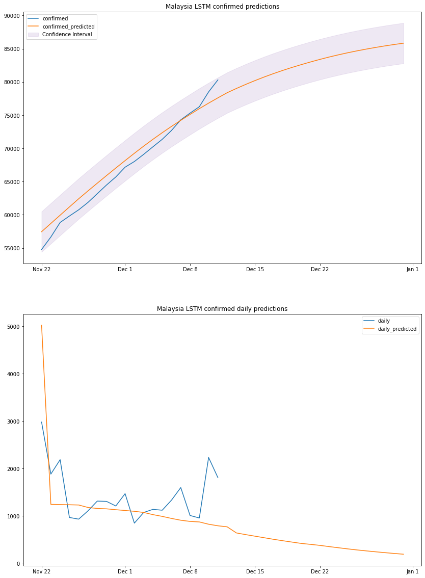
based on the above graph and previous dataframe output, we can conclude that by the end of 2020 Malaysia will have a total number of confirmed cases between 82k and 88k. We should take the predicted daily cases with a grain of salt since the model is linear, it cannot predict non-linear values.
To answer this question, we have to look back at how did we reduce the number of daily cases and stabilize the number of total confirmed cases in the first wave; the answer is mandated lockdowns.
Malaysia lockdown started from mid march and some might argue its still ongoing, however the currently ongoing variations of the lockdown are not as strict as the first lockdown and are less effective, here I try to show the effect the first strict lockdown had on the total number of cases, to further support the answer to question 4.
restricted lockdown Time frame
from 2020-03-16 until 2020-05-04
# generate a dataframe with given range
def get_range_df(start: str, end: str, df):
    target_df = df.loc[pd.to_datetime(start, format='%Y-%m-%d'):pd.to_datetime(end, format='%Y-%m-%d')]
    return target_df
my_lockdown = get_range_df('2020-03-16', '2020-05-04', my_con_series)
my_pre = get_range_df('2020-01-25', '2020-03-16', my_con_series)
my_after = get_range_df('2020-05-04', '2020-12-11', my_con_series)
plt.figure(figsize=(18,9))
plt.plot(my_lockdown, color="C7", label="during lockdown", linewidth=5)
plt.plot(my_pre, color="C8", label="before lockdown")
plt.plot(my_after, color="C3", label="after lockdown")
plt.legend()
plt.show()
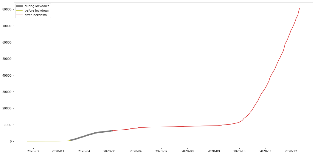
from the graph we can see that the number of total cases stabilized after the lockdown, meaning the number of daily cases was so low its not even visible on a graph, and this shows the effect the restricted lockdown had on the cases further proving the answer to question 4 to be correct.
A deep dive into the intricacies of deploying custom models to Amazon SageMaker

How to create a new novel datasets from a few set of images.
Data Science Project

Data Science Project